Analysing your Strava workouts with Python
- Introduction
- Getting your Strava data into a dataframe
- Calculating calories
- Question 1: How does the relationship between calorie count and distance change with type of workout?
- Question 2: What are the most common distances, altitudes, durations and start times?
- Question 3: What is the relationship between heart rate and pace?
- Question 4: How has my fitness changed over time?
- Question 5: Are morning or evening runs faster?
- Conclusion
- References and more links
Introduction
If you just care about analysing your own Strava data, skip ahead to the next section.
Amateur long-distance running is far from the most action-packed sport. A lot of the time, it’s actually quite boring. While running about the countryside and shipping off all my personal data to Strava, I’ve had a lot of time to think about what possible relationships there might be between different aspects of my runs.
There are some questions I want answered because they might actually be useful to know, like whether I can come up with useful measures of how my fitness has changed over time. But there’s also some things I want to know just for curiosity’s sake, like how often I start running at different times during the day.
I don’t particularly want to spend £54.99 per year for Strava Premium just so that I can answer these questions, but luckily, there are several great open-source tools like strava-offline, pandas and matplotlib which let you do all your own home-grown analysis.
In this post, I’ll walk through how you can get your own Strava data into a Pandas dataframe, ready for inspecting with Python. Then I’ll go over how I answered some of my own long-standing questions using different parts of the PyData ecosystem.
Getting your Strava data into a dataframe
strava-offline is a Python program that will keep a mirror of your Strava activities in a local SQLite database. While it would be possible to use the Strava API directly, using strava-offline prevents the need for messing around with getting access tokens, and it’s always nice to have a local copy of your own data in case Strava loses it.
There are installation instructions on the README, but it should just be as simple as:
$ pip install strava-offline
and then you can run the following command:
$ strava-offline sqlite
This will open Strava in a browser and ask for permissions. Once you’ve authenticated, it will pause for a while as it puts all your data in a SQLite database. By default, the database is stored at:
-
Mac:
~/Library/Application Support/strava_offline/strava.sqlite -
Linux:
~/.local/share/strava_offline/strava.sqlite -
Windows:
C:\Documents and Settings\<User>\Application Data\Local Settings\strava_offline\strava_offline/strava.sqlite
All activity data is stored in a table called activity. Now getting this data into a dataframe should be as simple as:
import sqlite3
import json
import pandas as pd

DATABASE_FILE = os.path.join(platformdirs.user_data_path("strava_offline"), "strava.sqlite")
con = sqlite3.connect(DATABASE_FILE)
df = pd.read_sql_query("SELECT * from activity", con)

df['json_parsed'] = df['json'].apply(json.loads) # Parse json into a new column
df = pd.concat([df, json_columns], axis=1) # Add parsed json to dataframe
df = df.drop(columns=['json_parsed']) # Remove json_parsed column
df = df.loc[:,~df.columns.duplicated()].copy() # Remove duplicate columns
df["datetime"] = pd.to_datetime(df["start_date_local"]) # Parse start_date
df.set_index("datetime") # Index by parsed date
This will leave you with a dataframe with the columns corresponding to a DetailedActivity as per the Strava API. Here they are sorted in rough order of interesting-ness:
| Attribute | Explanation |
|---|---|
sport_type |
Type of activity, e.g., “Run”, “Walk”, “Ride”. Details here. |
distance |
Distance (metres). |
elapsed_time |
Total workout time (seconds). |
moving_time |
Moving time (seconds). |
average_speed |
Average speed (metres/second). |
max_speed |
Max speed (metres/second). |
start_date_local |
Starting local time of your workout, in ISO 8601 standard. |
start_date |
Starting time of your workout, in ISO 8601 standard. |
datetime |
Parsed start_date_local from above. |
average_heartrate |
Average heart rate of athlete. |
max_heartrate |
Max heart rate of athlete. |
elev_low |
Lowest elevation (metres). |
elev_high |
Highest elevation (metres). |
total_elevation_gain |
Elevation gain (metres). |
average_cadence |
Average cadence of the activity. |
name |
Name of your workout. |
kudos_count |
Total kudos for the activity. |
commute |
Whether the activity was marked as a commute (0 or 1). |
trainer |
Whether the activity was recorded on a training machine (0 or 1). |
comment_count |
Total comments on the activity. |
athlete_count |
Number of athletes involved if this activity was a group activity. |
achievement_count |
Number of achievements for the activity. |
device_watts |
For rides only, whether wattage was reported by a recording device (0/1). |
kilojoules |
For rides only, kilojoules of energy burned during the workout. |
average_watts |
For rides only, the average wattage of the activity. |
And some of the more arcane columns:
| Attribute | Explanation |
|---|---|
pr_count |
Not mentioned in the Strava docs, maybe the number of personal records set on segments? |
has_heartrate |
Whether the activity has heart rate data (True/False). |
timezone |
Timezone, e.g., (GMT+00:00) Europe/London. |
has_location_data |
Whether the activity has location data (0 or 1). |
utc_offset |
UTC offset for local starting time. |
photo_count |
Number of photos. |
manual |
Whether you manually added the workout or tracked it somehow (True/False). |
private |
Whether the activity was private (True/False). |
visibility |
Visibility status of the workout, e.g., everyone. |
flagged |
Whether the activity is flagged (True/False). |
total_photo_count |
Total number of photos for this activity, including those linked to Instagram. |
has_kudoed |
Whether the athlete who requested this activity from the API has kudoed the activity (0/1). |
external_id |
Name of your workout as it was uploaded. |
gear_id |
ID used by Strava if you’ve added your gear to Strava. |
athlete.id |
Internal ID for the athlete that completed this activity. |
athlete.resource_state |
Not mentioned in the Strava docs. |
upload_id |
Internal ID used by Strava for activities. |
type |
Deprecated alternative to sport_type. |
upload_id_str |
String version of the upload ID? |
heartrate_opt_out |
Whether the athlete has opted out of having their heart rate data stored (True/False). |
display_hide_heartrate_option |
Not mentioned in the Strava docs. |
from_accepted_tag |
Not mentioned in the Strava docs. |
location_city |
Not documented, but null in all responses. |
location_state |
Not documented, but null in all responses. |
location_country |
Not documented, but null in all responses. |
json |
Full response from the Strava API as stored by strava-offline. |
resource_state |
Mystery attribute not documented by Strava API. |
workout_type |
Mystery attribute documented by Strava API as “the activity’s workout type”. |
Calculating calories
If you’ve carefully studied the list above, you might’ve seen that each activity has an associated kilojoules attribute, but this only is available for rides (despite runs also having heart rate data). If you want to explore the relationship between calorie counts and other factors, you might need to approximate the calorie counts in terms of other variables.
One way to do this is to first estimate your VO2 max and then use this formula for calories in terms of workout duration, average heart rate, weight and age. This is quite straightforward:
# Personal stats, not for a specific run but just in general
max_heartrate = 200
resting_heartrate = 55
weight = 75
age = 20

# Approximate formula
vo2_max = 15.3 * (max_heartrate / resting_heartrate)

def calories(time, average_heartrate):
    return time * (0.634*average_heartrate + 0.404*vo2_max + 0.394*weight + 0.271*age - 95.7735) / 4.184

df["estimated_calories"] = df.apply(lambda row: row["moving_time"] / 60, row["average_heartrate"], axis=1)

# Optionally, forget workouts without heartrate data
df = df.dropna(subset=["estimated_calories"])
But beware! Using this formula is going to be an approximation, and doesn’t account for things like how your weight or age has changed over time. Moreover, if you don’t have heart rate data for your workouts, then you’ll have to use an approximation that relies only on the workout duration. This isn’t ideal, because it means all workouts will be considered at the same level of difficulty, rather than accounting for the fact that some workouts might be harder than others.
Question 1: How does the relationship between calorie count and distance change with type of workout?
I’m going to be using a Jupyter notebook. All the answers to these questions are going to be subjective and one relationship or correlation that appears for me might not appear for everyone. I also doubt that the answers are very interesting – but I hope that these might serve as a useful example that you can use to kick-start your own analysis.
I’ve wondered for a long time how the calorie count of a workout varies with distance. It won’t be surprising that increasing the distance will increase the calories burned, but I’m more interested in how the relationship changes with mode of workout: is it more efficient to walk or run the same distance? Or, put in different terms: if you’re starving in the desert and have just one cookie to fuel your journey to an oasis, would it be a better idea to eat the cookie and then run, or eat the cookie and walk?
The easiest way to visualise this is a scatter plot with distance on the $x$-axis and energy on the $y$-axis:
import matplotlib.pyplot as plt

is_run = df["sport_type"] == "Run"
is_walk = df["sport_type"] == "Walk"

plt.scatter(df[is_run]["distance"], df[is_run]["estimated_calories"].to_numpy(), color='black', label="Run")
plt.scatter(df[is_walk]["distance"], df[is_walk]["estimated_calories"].to_numpy(), color='blue', label="Walk")

plt.ylabel("Energy (kcal)")
plt.xlabel("Distance (m)")

plt.legend()
plt.title("Distance vs Energy when Running or Walking")

plt.axvline(x=5000, color='red', linestyle='--', linewidth=2)    # 5K
plt.axvline(x=10000, color='red', linestyle='--', linewidth=2)   # 10K
plt.axvline(x=21097, color='red', linestyle='--', linewidth=2)   # Half marathon
plt.axvline(x=21097*2, color='red', linestyle='--', linewidth=2) # Full marathon

plt.show()
This produces the following plot:
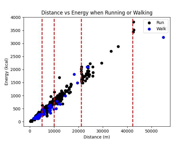
Eyeballing the relationship, it looks like running is slightly less efficient. Things are more extreme when you account for the calories you would be burning anyway on account of your basal metabolic rate.
# Calories burned per second assuming 70bpm resting
background_calories_per_second = calories(1, 70) / 60

x_run, y_run = df[is_run]["distance"], df[is_run]["estimated_calories"] - df[is_run]["elapsed_time"] * background_calories_per_second
x_walk, y_walk = df[is_walk]["distance"], df[is_walk]["estimated_calories"] - df[is_walk]["elapsed_time"] * background_calories_per_second

plt.scatter(x_run, y_run, color='black', label="Run")
plt.scatter(x_walk, y_walk, color='blue', label="Walk")

# ...plot the same as above...
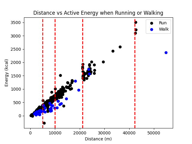
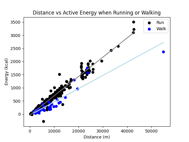
There are several ways of adding two lines of best fit, one way is to use sklearn.linear_model:
plt.scatter(x_run, y_run, color='black', label="Run")
plt.scatter(x_walk, y_walk, color='blue', label="Walk")

plt.plot(x_run, linear_model.LinearRegression().fit(x_run.to_numpy()[:, None], y_run).predict(x_run.to_numpy()[:, None]), "grey")
plt.plot(x_walk, linear_model.LinearRegression().fit(x_walk.to_numpy()[:, None], y_walk).predict(x_walk.to_numpy()[:, None]), "lightblue")
Question 2: What are the most common distances, altitudes, durations and start times?
I’ve also wondered for a long time what my modal distances, altitudes, durations and start times are. These questions can be answered quite straightforwardly by just plotting a histogram on each of the different columns. Here it is for distance:
plt.hist(df["distance"], bins=80) # (80m bins)
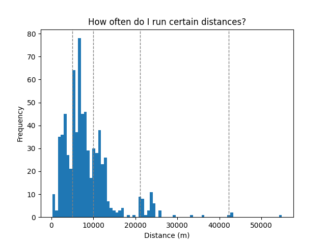
I’ve also labelled 5K, 10K, a half marathon and a full marathon. You can see there’s little peaks for the half marathon and full marathon distance, since those distances make good stopping points for a run.
For elevation, it’s almost identical except using the elev_low attribute:
plt.hist(df["elev_low"], bins=150)

plt.xlabel("Lowest elevation (m)")
plt.ylabel("Frequency")

plt.title("What are my most frequent elevations?")
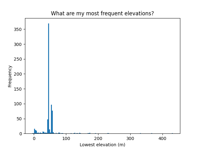
There’s a couple interesting things about this; firstly, there are clearly two peaks. These correspond to the runs that I do while at home or while at university. Secondly, there’s also quite a lot of range. I was curious about the runs apparently below sea level and around 400 metres above sea level, and these can be identified by:
df[df["elev_low"] < 0] # or,
df[df["elev_low"] > 400]
You can look up them up on Strava to see where they were. For me, it turns out that the runs measured as below sea level were runs at the beach (maybe dipping below sea level on account of GPS error rather than actually running underwater). There was also nothing particularly special about the run 400 metres above sea level, apart from that it was in a very hilly part of the country.
Finally, this is the distribution for workout duration:
# Oops, I've left Strava on a few times by accident
not_elapsed_time_outlier = df["elapsed_time"] < 2500*60

plt.hist(df[not_elapsed_time_outlier]["elapsed_time"] / 60, bins=50)
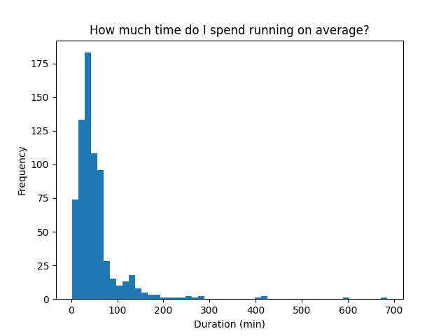
Since workout duration is going to be roughly proportional to distance, this is very similar to the distance distribution.
Question 3: What is the relationship between heart rate and pace?
Another question I’ve wondered about is how the average heart rate affects the average speed of a run. Again, it’s won’t be an surprise if a higher average heart rate increases the average speed, but it would be interesting to see the exact nature of this relationship.
plt.scatter(df[is_run].dropna(subset=["average_heartrate"])["average_heartrate"], df[is_run]["average_speed"], color='black', label="Run")
plt.scatter(df[is_walk].dropna(subset=["average_heartrate"])["average_heartrate"], df[is_walk]["average_speed"], color='blue', label="Walk")

plt.xlabel("Average heart rate (BPM)")
plt.ylabel("Average speed (m/s)")

plt.legend()
plt.title("How does average heart rate affect average speed?")
plt.show()
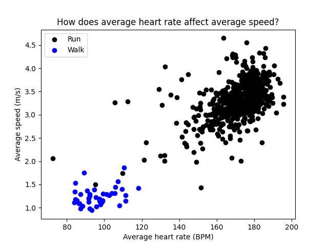
There is, as you would expect, a semi-linear relationship between the two variables. Runs far off the diagonal correspond to efficient and less efficient runs respectively. What about max heart rate and max speed?
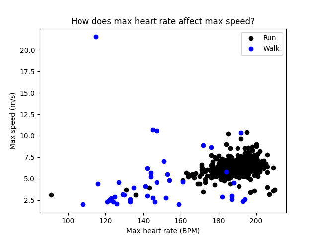
There’s a clear outlier for a 20 metres per second walk. Considering this is almost double the fastest recorded running speed of a human, I think it might be a mistake.
Question 4: How has my fitness changed over time?
There’s several ways that this could be measured. Maybe the simplest is just to plot how my average speed has changed over time. Here I’m taking the rolling average over 10 runs since otherwise the plot is quite spiky:
plt.plot(df["datetime"], df["average_speed"].rolling(10).mean())
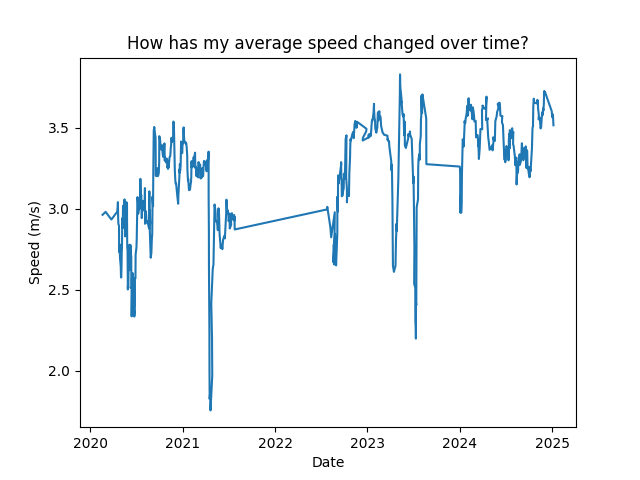
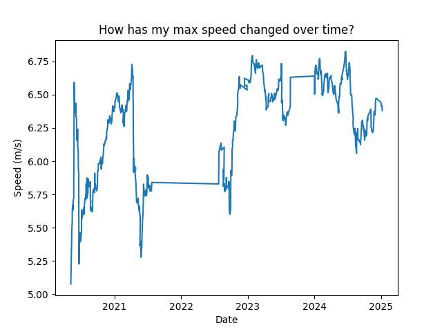
The horizontal and diagonal lines are times I took a break from running or from recording workouts on Strava. It’s also interesting to look at max_speed:
plt.plot(df["datetime"], df["max_speed"].rolling(10).mean())
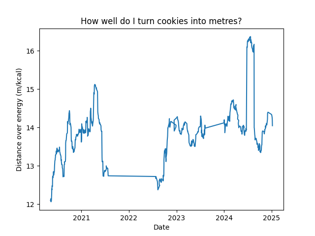
Another way of measuring fitness over time is by measuring how many calories are needed to run one metre.
plt.plot(df[is_run]["datetime"], (df[is_run]["distance"] / df[is_run]["estimated_calories"]).rolling(30).mean())
Question 5: Are morning or evening runs faster?
Answering this question is a little bit more difficult since it’s necessary to regroup the data by time of day rather than datetime. First, I’ll just plot the distribution of runs by time of day. This can be done like so:
window_size = 20 # in minutes
num_labels = 6

chunks = (df["datetime"].dt.hour * 60 + df["datetime"].dt.minute) // window_size
chunk_counts = df.groupby(chunks).size().to_frame(name="count")

ticks = np.arange(0, (1440//window_size)+1, (1440//(window_size * (num_labels))))
labels = []
for i in ticks:
    hour = i * window_size // 60
    minute = (i * window_size) % 60
    labels.append(f"{hour:02d}:{minute:02d}")

plt.bar(chunk_counts.index, chunk_counts["count"], width=1.0)
plt.xticks(ticks, labels)
plt.show()
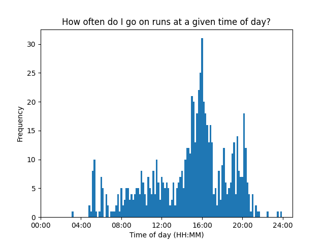
(It’s also necessary to be careful here with using start_time_local rather than start_time, since start_time is always measured relative to GMT+0).
To plot speed, I can take the mean of each group:
chunk_speeds = df.groupby(chunks)["max_speed"].mean().to_frame(name="max_speed")
plt.bar(chunk_speeds.index, chunk_speeds["max_speed"], width=1.0)
plt.xticks(ticks, labels)

plt.show()
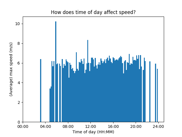
It looks like max speed is relatively constant. I find this a little bit surprising since it always feels like I run faster when it’s dark, but apparently not.
Conclusion
I hope that you have fun analysing your Strava data and answering some of your own questions. The full code I used to produce all the plots above can be found in this gist.
References and more links
- Analysing Strava Data with Python is another post on the same topic and goes over some different visualisations to the ones I’ve presented here and takes a more exploratory approach.
-
Get Your Strava Activity Data using Python (2023) covers how to access your Strava data using the API rather than
strava-offline.